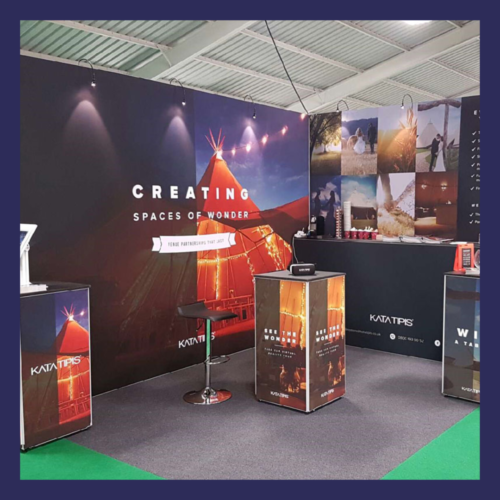
Autumn is renowned within the print and signage industry as being exhibition season, with large indoor events taking place up and down the country across all industries.
Over our 25+ years of existence, we’ve worked with print and signage businesses as well as exhibitors to provide many bespoke solutions. Whether it’s for a 1,000 square metre monster or a 3 by 3 shell scheme, we work closely with our customers to make the most of your space and ensure you’ll always stand out from the crowd.
Check out our top 5 stand design tips below along with some accompanying product recommendations.
1. Fail to Plan, Plan to Fail
Don’t be tempted to dive straight into the exciting stuff, we’re talking initial concepts and gimmicky promotional items.
The most important part of your project will be taking time at the outset to really understand what you are looking to achieve, how you will measure success and the best way to achieve this. Sure, it’s not as exciting as those first sketches and seeing your ideas brought to life, however you will save time (and undoubtedly money) further down the road whilst almost certainly arriving at a superior solution.
Here’s 4 key components we like to have in place before commencing a project:
- Clearly defined objective(s)
- Identified target market
- Brand Guidelines
- Stand Location


2. Make Your Messages Count
With the above in place, you’ll be far better positioned to put together a comprehensive design brief and start on initial concepts.
When it comes to text on your stand, we’d always recommend keeping this to a minimum. The aim here is to get attention and pique people’s interest enough to draw them in, not tell them absolutely everything they need to know in one go, your sales team and supporting marketing collateral should take care of this.
Remember, your messaging should be:
- On brand
- Appealing to your target audience
- Simple – don’t go overboard with text, often less is more.
- Viewable – ensure important content is high up on your stand, so it isn’t blocked by delegates and can be seen from a distance.
Recommended product: Freestanding Tension Fabric Stand
Quite possibly our favourite exhibition display product, freestanding tension fabric systems can be used on larger stands to create an impressive focal point, or when working with a smaller space and/or budget you can build your entire stand using this system.
The modular frames are easy to transport and assemble, allowing you to transform the shape and size of your stand. The aluminium profile is designed to be used with graphics push fitted into a thin recess, giving you the ultimate flexibility with the placement of your messaging.
Moreover, once you’ve invested in the frame, you can completely revamp/adapt your stand with new graphics for a fraction of the cost, making this the perfect solution when attending several events with varying target audiences.
3. Let There Be Light
Display lighting enhances the atmosphere and is very effective at highlighting the best areas of your stand, particularly if you’re showcasing a range of products. Exhibition venues are quite often dimly lit, so we’d always recommend taking additional lighting with you no matter the location or stand design. It’s better to have extra lighting to hand and not need it than be left in the dark!
Recommended Product: Backlit Tension Fabric Solutions
Free standing tension fabric frames can be supplied with LED lighting that fix to the top of your frame. However, if you really wish to stand out from the crowd, LEDs can be fitted into your frame (edge lit or backlit) to produce striking graphics, sure to stop delegates in their tracks and serve as the perfect conversation starter.
Honourable mention: LED Lightbox


4. Build Up, Not Out!
Just like in popular city centres, floor space at exhibitions come at a premium, so building up rather than out is always a good option when it comes to making the most of your budget.
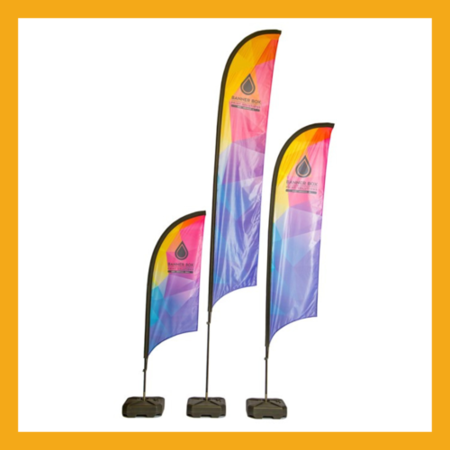
Recommended Product: Feather Flags
This can be achieved in a variety of ways and sometimes a bespoke solution will work best depending on your budget. However, in many cases using a large feather flag will help you rise above the rest and be seen from afar, whilst taking up minimal floor space (see below). Just be sure to check with the venue if there are any height restrictions in place.
Honourable mention: Event Flagpoles
5. Floor Space Is Your Friend
Just like with your messaging, don’t be tempted to try and fill every inch of the floor on your stand.
It’s vitally important to leave plenty of room at the entrance of your stand to allow delegates easy access and we’d also suggest keeping it clear of items that have a barrier like affect. e.g. tables and leaflet holders. Once you’ve enticed delegates in, you want them to hang around a while, so it’s equally important to leave enough space for people to “linger in.” So, choose your display solutions wisely.
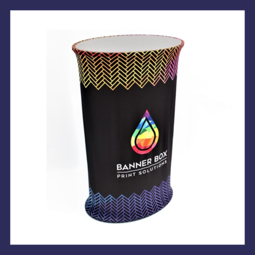
Recommended product: Fabric Pop Up Counter
The counter is constructed from elliptical aluminium tubes secured into a sturdy wooden base and lid. The system is easily assembled by push fitting the tubes together, providing a surface for marketing material and valuable storage space, an aspect often overlooked with stand design.
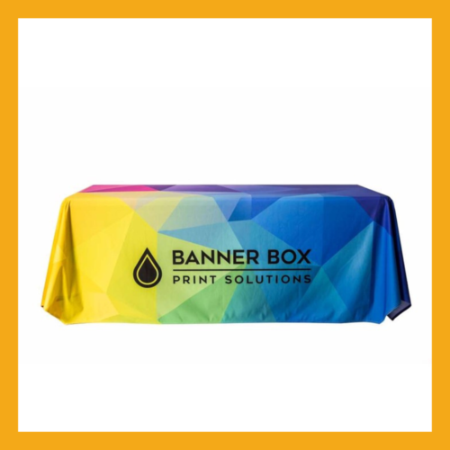
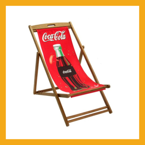
Honourable mention: Branded Chairs, Printed Tablecloths and Tube Walls.

Our Top 5 Exhibition Display Products
Here’s what products our customers have been purchasing in 2022.
Let’s Talk Exhibitions
Got a project in mind, let’s get the job done.

